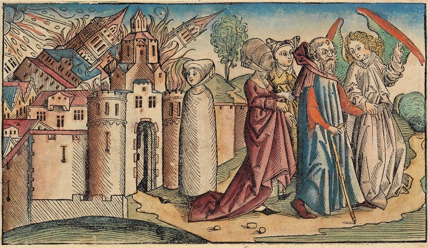
Had I wanted a medieval cover, this image might have worked. The falling towers - England always at war. The wrapped woman - a medieval description of a pillar of salt - as Isabelle. The dismissive courtiers. The angel, indicative of the Church’s power. But I wanted a more modern image. Isabelle’s struggle to become her own woman amid men of power still resonates.
Plus, remember my adjectives: immersive, dark, hopeful, passionate, satisfying. The flowers were passionate and satisfying, but not all that dark. And finally, weirdly, I’m not a fan of blue. Blue sky? All day long. Blue on walls, blouses, or covers? Not so much.
I sent back two of the designs with tweak requests.
Several people chose this cover. It’s beautiful but for me, the colors were too pretty, even with the subversive touch of olive green. I asked for a different palette, smoething more bitter. Also, I thought the subtitle and my name were too big. (What author says that? LOL).
I liked this font, the placement and size of the text. The slighly dark vibe. But the turret looked like a chimney pot on which the bird had settled. I wanted to see more castle and an active bird. More movement.
I sent my comments back to the designer and waited. We were so close. BTW, full props to Julie Metz, the artist of all this beauty.


excellent process and result
Such a difficult choice! I see your point about the colors, and I like them both. It's exciting!